 In our last blog article we expanded on the introduction of our NITRO™ technology layer by discussing the role of User Interface & User Experience in our product family.
When it comes to User Interface, the focus is on functionality and the user’s interaction with a digital environment. In short, we want our products to be easy-to-use while addressing core business needs. User Experience is a wider umbrella that includes not only usability, but also branding, colors, layout, and navigation.
Although UX consists of multiple variables, the standards by which “good” UX is measured are fairly simple: Were the users able to easily use the application? Did they enjoy using the product?
The tandem of UI & UX is one of the core pillars of our NITRO™ back-end technology layer and plays a significant role in expanding the native functionality of Microsoft SharePoint and Office 365. NITRO™ transforms them from communication & collaboration platforms into highly relevant, and configurable, business application platforms. NITRO was developed in two versions, SharePoint 2013/2016 on-premises and Office 365. Each one adheres to the development guidelines and Microsoft standards for its environment. For example, NITRO for Office 365 is 100% native to Office 365 and uses no legacy on-premises code.
Our NITRO™ layer is founded on core ITSM principles and, from a software development perspective, is manifested in the form of “Three Pillars of Application Design”: UI & UX, Workflows & Processes, and Reporting & Analytics. These aren’t three arbitrary ideas but, rather, are seamlessly integrated features. In a nutshell, they represent our development philosophy.
How to Make UX Intuitive?
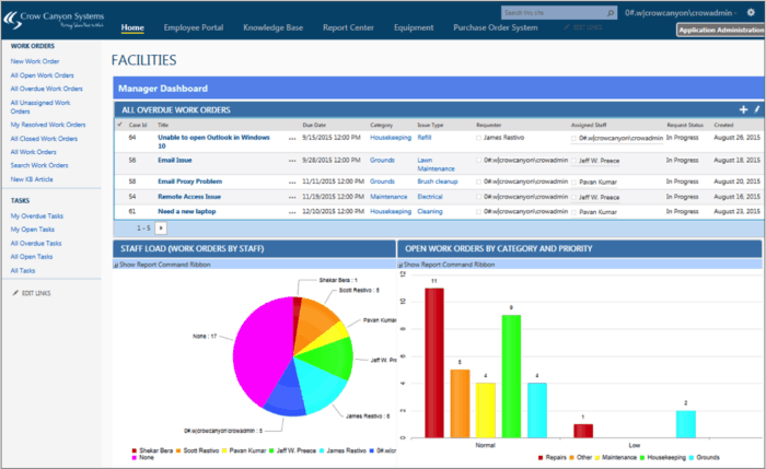
We start with UI & UX because all products need to be engaging, easy-to-use, and intuitive. Being “intuitive,” though, is often easier said than done — how can a solution be relevant to your business needs? We address the challenge of being intuitive and relevant by providing a high degree of configurable functionality in our product family. For User Engagement, this means that you can select, specify, arrange, and present content as you see fit. For example, clients who use our Facilities Management system can brand the product to fit their company’s look & feel as well as customize dashboards to include tables, charts, and forms.
In the Facilities Management dashboard graphic below, the content has been customized to convey critical information at-a-glance, such as an overdue work orders table, a staff load pie chart, and a filtered open work orders bar chart.

An intuitive product gives you the power to craft the user experience, with the ability to modify and adjust as users give their feedback or the application expands usage.
UI & UX: The Bridge to Workflows
Beyond the interface and experience lies functionality: how do you use the product? The business requirements addressed by the Crow Canyon product family rely heavily on process-based actions. For example, our IT Help Desk system guides support specialists through the ticketing process: users create a ticket (from e-mail, SharePoint, telephone, etc.), Support personnel capture more information via forms, the ticket is sent to the appropriate recipient, knowledge bases are accessed during resolution, the ticket is sent for approval, and the requestor is automatically notified of the resolution. The entire process is tracked, captured, and made available for subsequent analysis.
This Workflow & Process-oriented approach, like UI & UX, is entirely configurable. Our products empower companies to create their own processes based on how the company works. This level of flexibility is unique in the IT world because it shifts attention away from forced adaptation to user-defined experiences. The relationship between UI & UX and Workflows & Processes is a seamless one: the former is focused on how we experience a product while the latter emphasizes how the product is used.
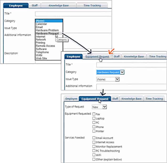
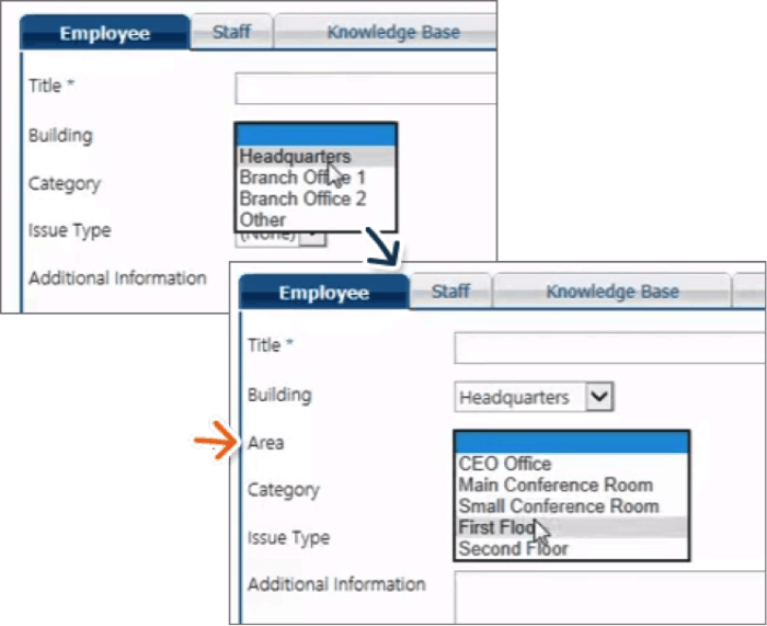
For example, our products support a functionality called Dynamic Tabs and Dynamic Fields. Both of these functions — used when creating forms — represent the marriage of UI & UX with Workflows & Processes. The Dynamic Tabs feature creates a new tab when a specific option is selected from a drop-down menu; this enables organizations to build robust forms that automatically expand or contract based on user selection.
In the example below, selecting “Hardware Request” from the Category field automatically creates a new tab called “Equipment Request,” which enables users to input more refined data.

The Dynamic Fields feature works in the same way by creating additional fields based on selections made in a different field. In the graphic below, when the user selects “Headquarters” in the Building field, a new field appears directly below it called “Area.”

Both of these features are examples of how our products empower organizations to use UI-based functions to deliver engaging Workflows & Processes. This level of configurability is applied throughout all of our products, effectively allowing you to build your own business application experience in a Microsoft SharePoint or Office 365 environment.
Conclusion
Over the next few weeks we will explore NITRO™ in more depth and look at how its Three Pillars (UI/UX, Workflows & Processes, and Reporting & Analytics) are used to bolster your SharePoint or Office 365 experience.
Also, don’t forget to register for our upcoming User Interface / User Experience Webinar (October 6th) to learn more about how User Engagement impacts our NITRO™-powered business solutions.
Want to learn more about how our solutions can help your company engage with your customers and/or users? Give us a call at 1-925-478-3110 or contact us by e-mail at sales@crowcanyon.com
